Case Study
Food From The Heart Web App
Food From The Heart is a charity that distributes free food to the needy. Their vision was to increase volunteer engagement through automation and better user onboarding.
- Front-end
- Interactive
- Back-end
- Dev-Ops
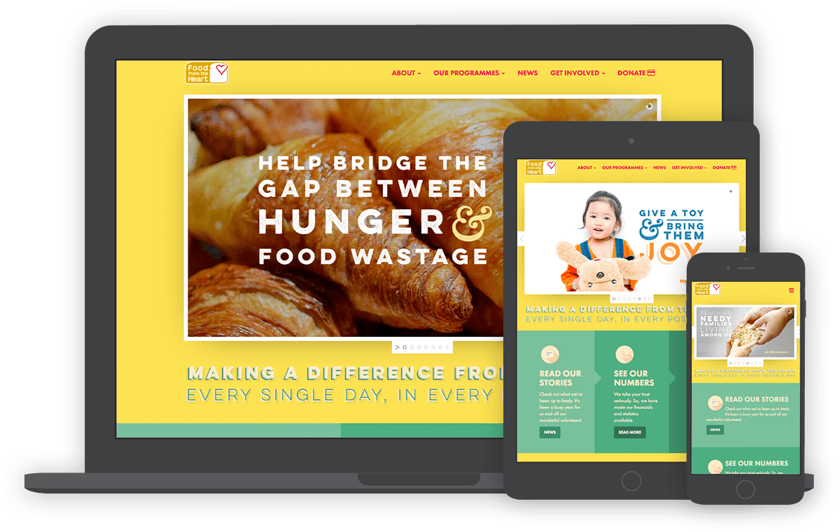
Food From The Heart is a charity that distributes free food to the needy. Their vision was to increase volunteer engagement through automation and better user onboarding.


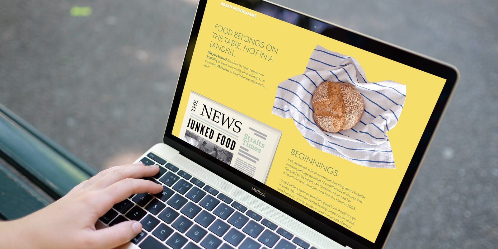

The staff of Food From The Heart (FFTH) had their plates overflowing with repetitive enquiries and tasks. They wanted a web app that allowed volunteers, donors and the public to have direct access to information and volunteering opportunities without them having to pick up the phone.

The old website's content was laid out in a way that required many clicks to discover a full picture of the charity. Signing up as a volunteer was a confusing and error-prone experience. The new website needed to provide frictionless paths towards becoming volunteers or donors.

As part of its digital transformation, Food From The Heart was in the process of integrating with Salesforce. By allowing volunteers to sign up for volunteering opportunities through the web app and keeping Salesforce in sync, we would save their staff many hours of manual coordination every week.

The only way to donate online at the time was through SG Gives, a government website shared with every other charity. By integrating the eNETS payment gateway into the website, the user experience of donating would be seamless. It would also improve related administrative workflows.

Most potential volunteers knew Food From The Heart only for its bread distribution programme. The charity needed to inform its audience about the four other core programmes and help them to find the opportunities that best fit their interests and resources, in a way that piqued their curiosity and without inundating them with information.
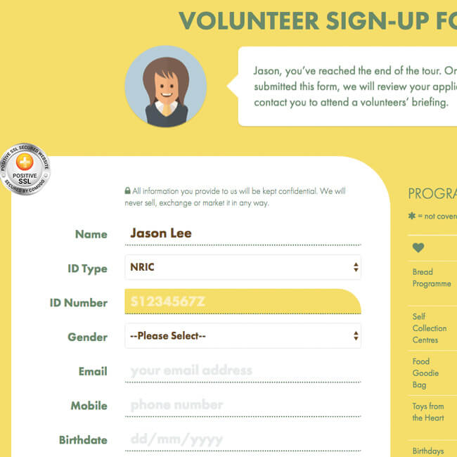
Carol Wee, Senior Executive at FFTH, came up with the idea of an interactive tour. Working collaboratively through several iterations, Zek Interactive and the charity designed a flow that gives users an overview of a programme, its requirements and asks for an indication of interest in just twenty seconds. At the end of the tour, the user would have a pre-filled sign-up form based on their indicated interests. This low-friction interactive tour has yielded over 2,500 successful sign-ups in the past year, the best any sign-up sequence has ever performed on their website.
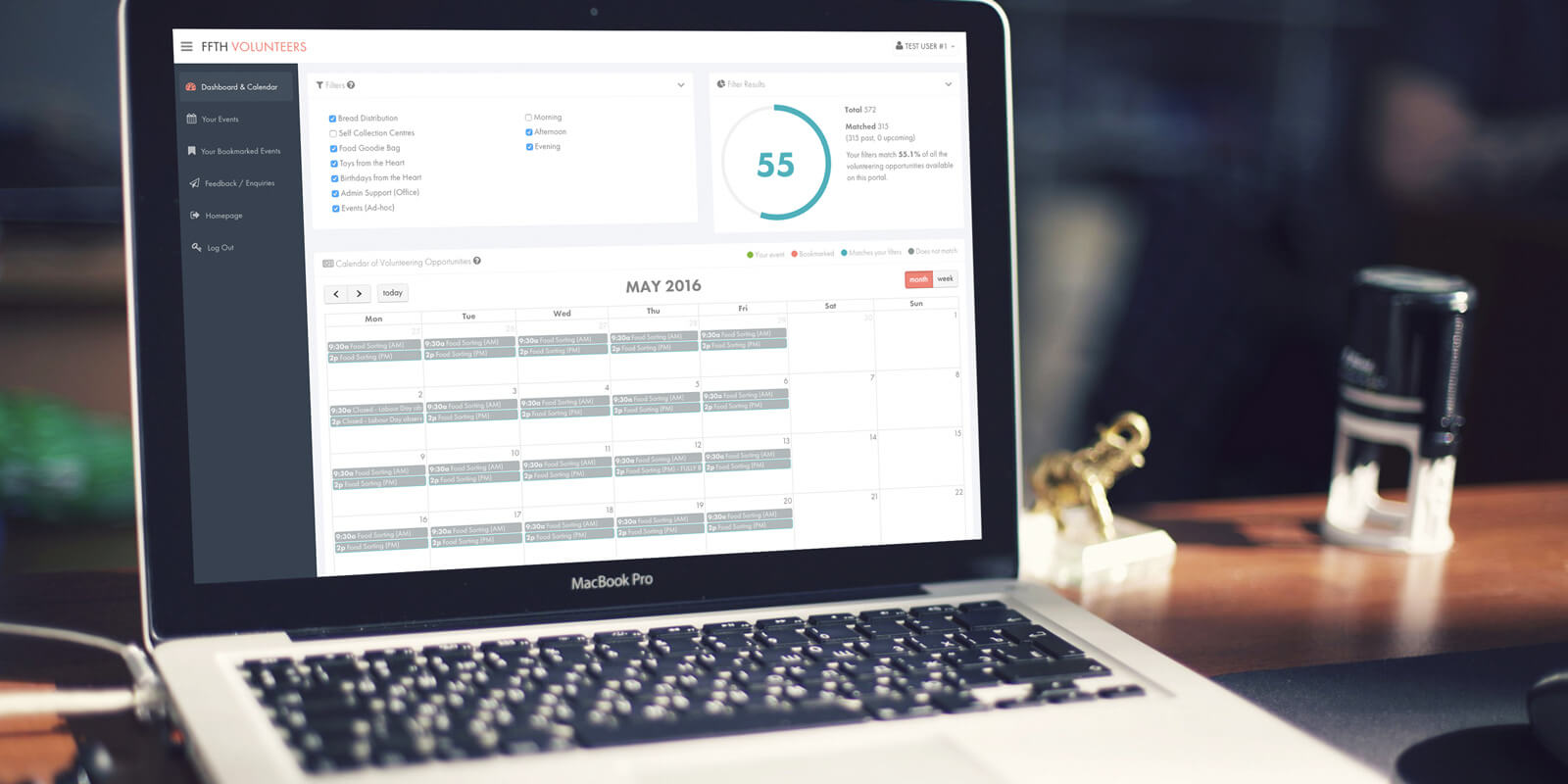
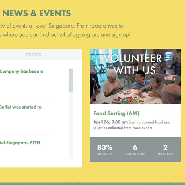
Answering repeated questions about upcoming events. Making individual calls to fill slots. Coordinating corporate volunteer programmes. The Volunteer Portal would solve one of the most pressing issues — too much time was being spent on tasks that could be solved by self-service. It was critical that we designed it to be as easy as possible for existing volunteers to pick up.
The platform authenticates volunteers with the information in the Salesforce database and allows them to bookmark events and register for them. Each user has a personal dashboard that recommends volunteering opportunities based on their saved preferences. For administrators, it's simple to add ad-hoc or recurring events, set event capacities and cut-off dates.

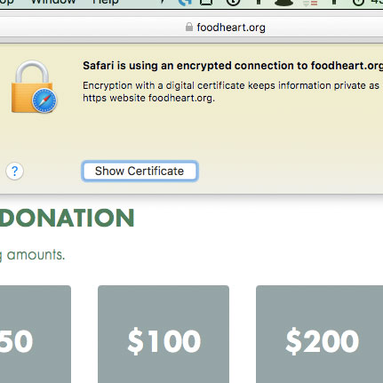
Handling donations and personal information is a heavy responsibility for the charity, so we took every precaution. We locked down the server with very limited access, implemented HTTPS for the entire website, and ensured that all data was securely stored. The web app hands off the user to eNETS for payment processing. Since the launch of the donation page, Food From The Heart has seen a sustained upward trend in on-site donations.
 User onboarding: over 4,400 users have successfully signed up as volunteers in the past two years. The trend continues to increase.
 Process automation saves hundreds of man-hours per year by enabling volunteers to manage their involvement through the Volunteer Portal.
 Solid & secure: with Test-Driven Development, HTTPS, 24/7 server monitoring and hourly backups, it's built to last.
 The new Food From The Heart website has delivered on many levels, in terms of design, usability and on our long-term goals. It represents our core message perfectly; it helps individual and corporate volunteers navigate our volunteering opportunities and facilitates fuss-free registrations. We love it, and many volunteers have told us they do too. Not only have we seen increased online donations, we’re also seeing interest grow from the kind of users we previously weren't so effective at attracting.
Great job overall. You have given our website a major facelift. Furthermore, there are now functions in place to help us increase our engagement with our volunteers and the general public.
We are really happy with the new website. Definitely a breath of fresh air. It's fully functional and interactive, making it a seamless platform for our potential volunteers/donors to know more about the organisation in an engaging manner.